valley plains | brand development
Creative Director: Debbie Christensen
Art Director: Olivia Zange
Agency: broadhead
Creative Director: Debbie Christensen
Art Director: Olivia Zange
Agency: broadhead
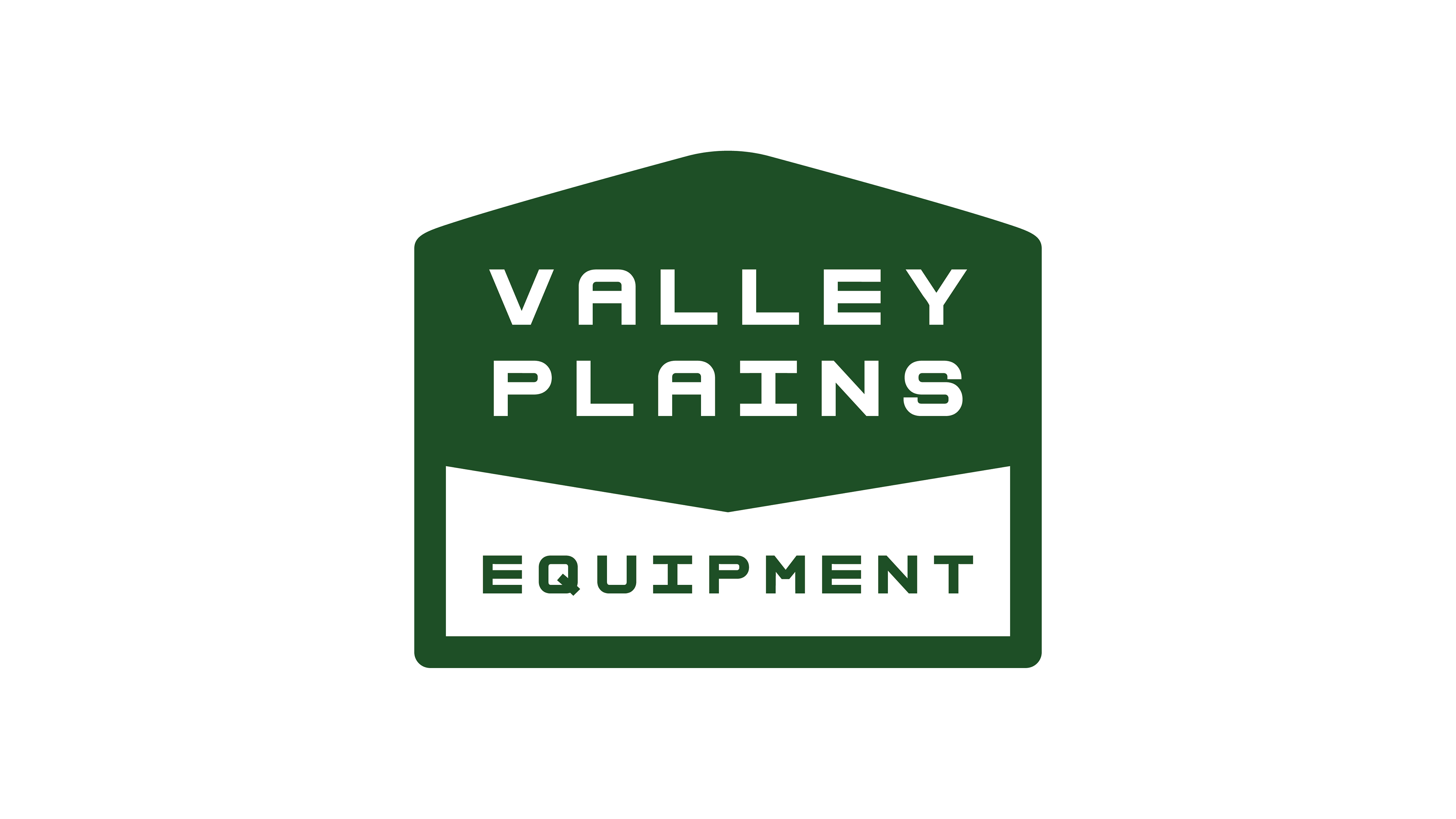
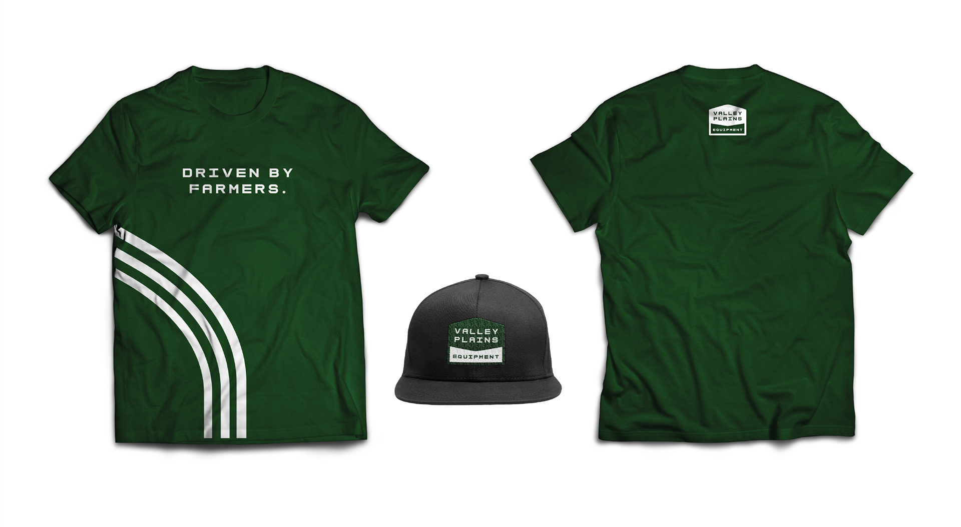
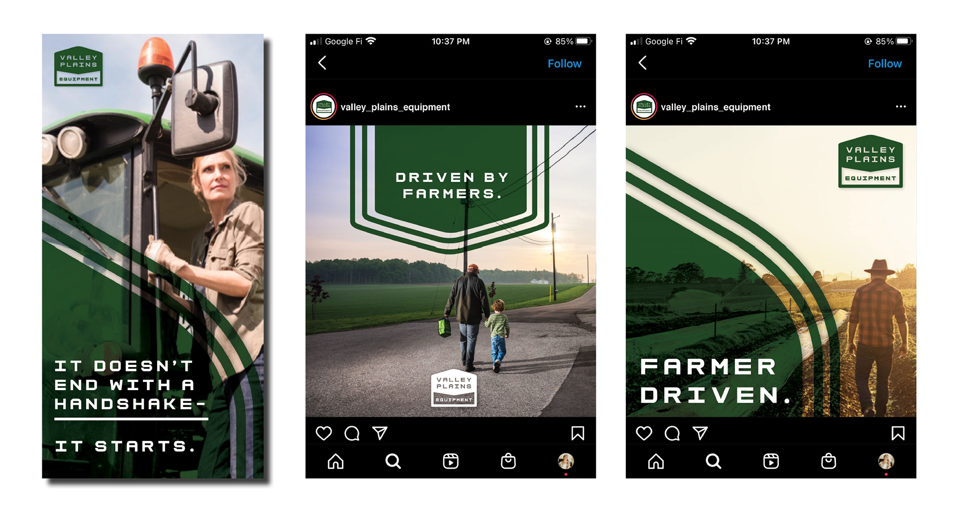
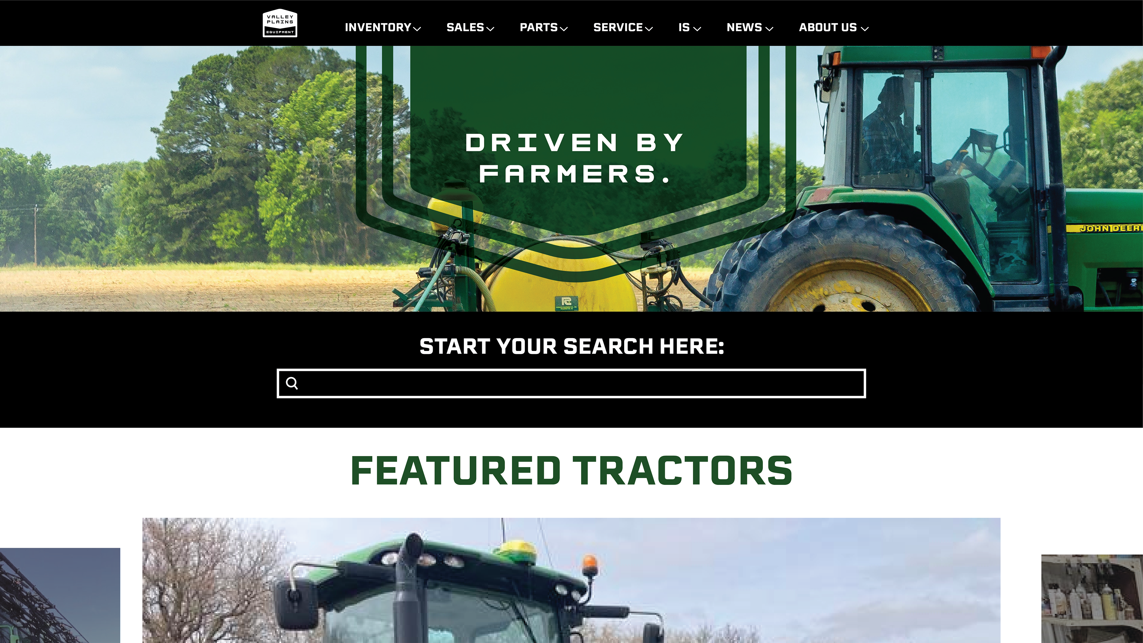
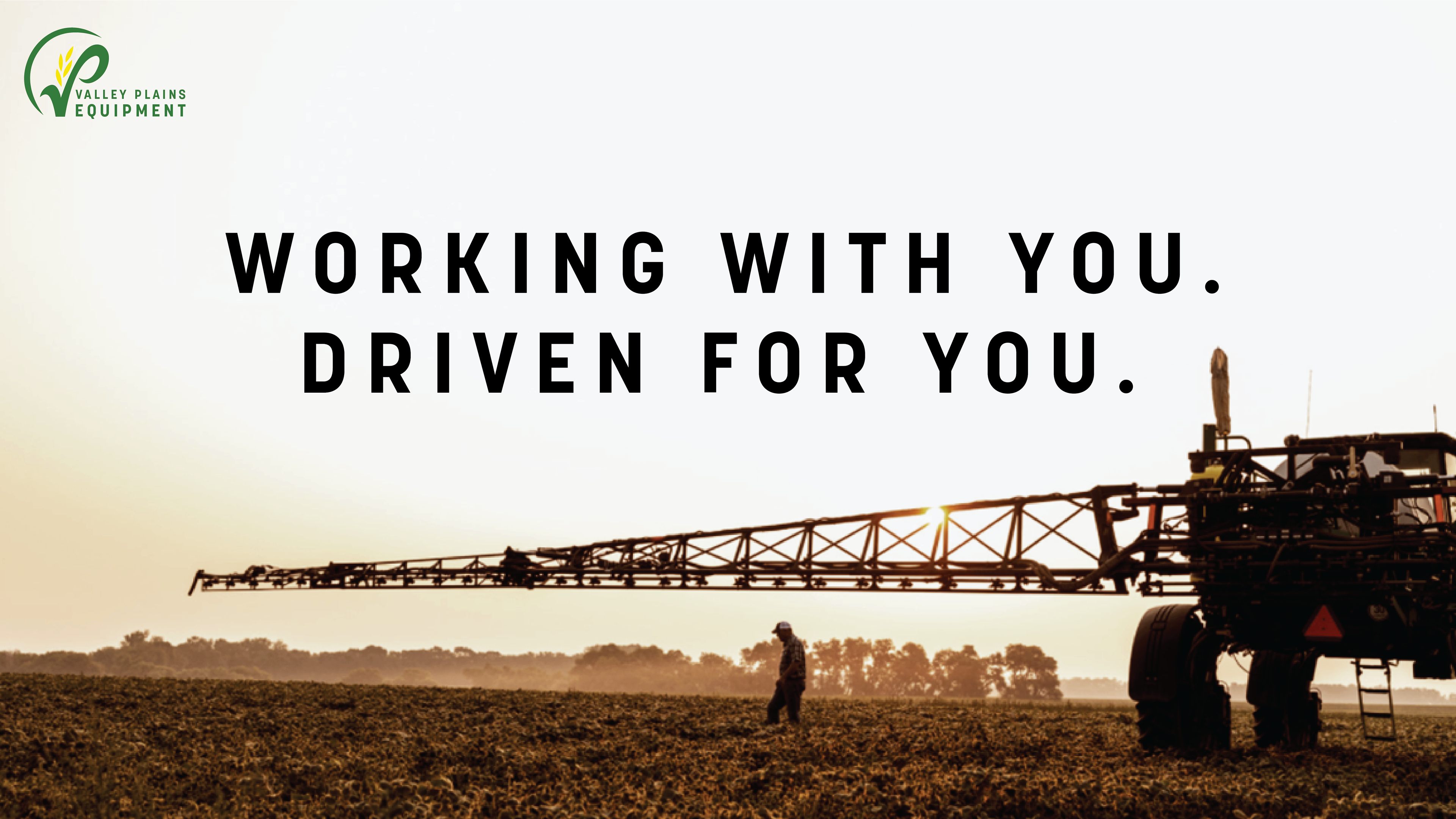
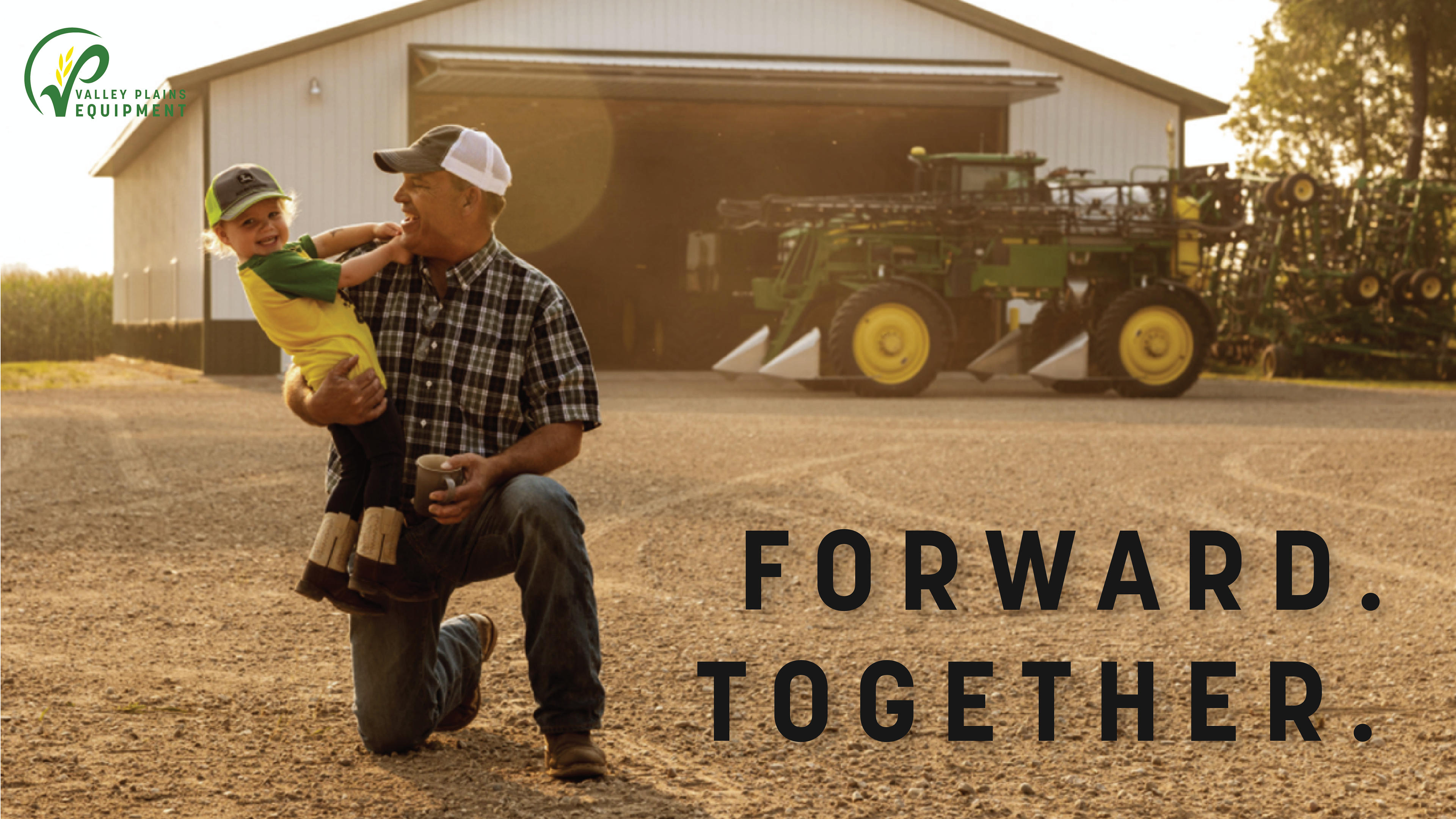
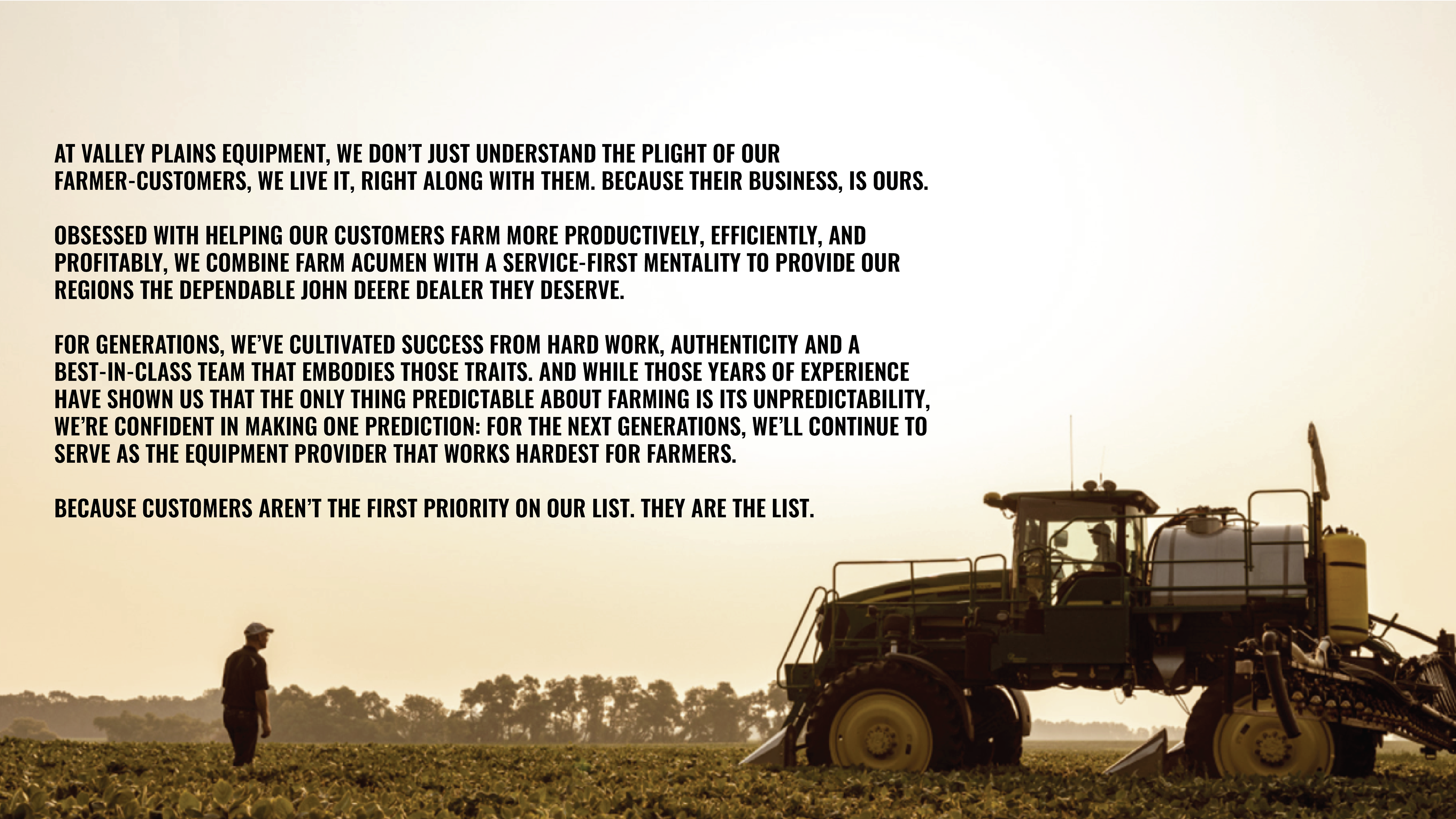
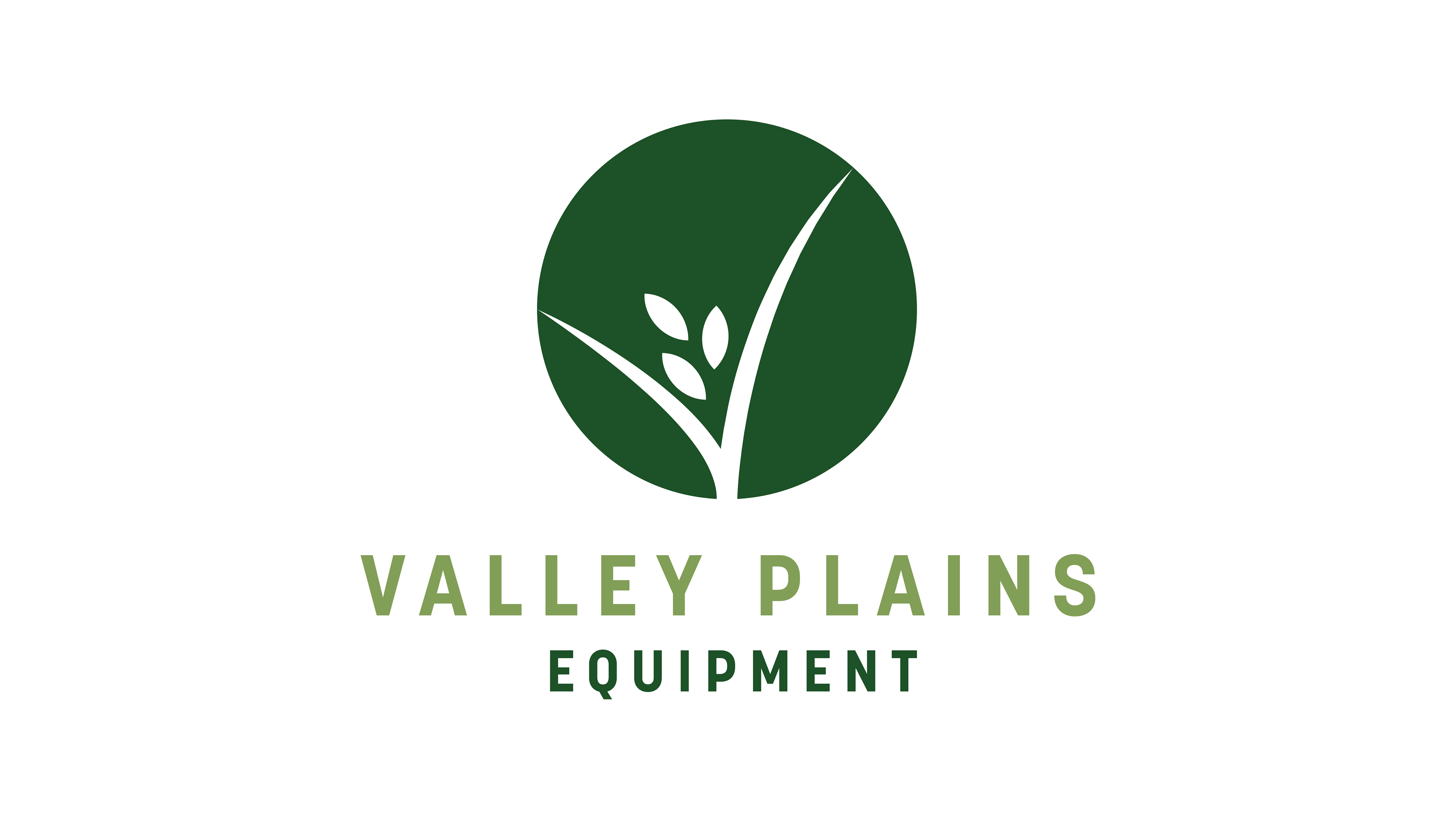
Valley Plains is an authorized seller and repair shop of John Deere tractors looking for an update in their logo and branding. We were able to provide a slight modernization to their logo along with brand guidelines that show how to use color, graphic elements and photography. Below you will find both the final product as well as a short case study in the other concepts presented.

Valley Plains Equipment
Based in North Dakota, Valley Plains is a certified John Deere Dealer that was looking to refresh their branding while staying connected to the John Deere brand. I had the opportunity to explore updating their logo as well as color system, patterns, and photography style. Below is where we started with the original Valley Plains logo.
Process
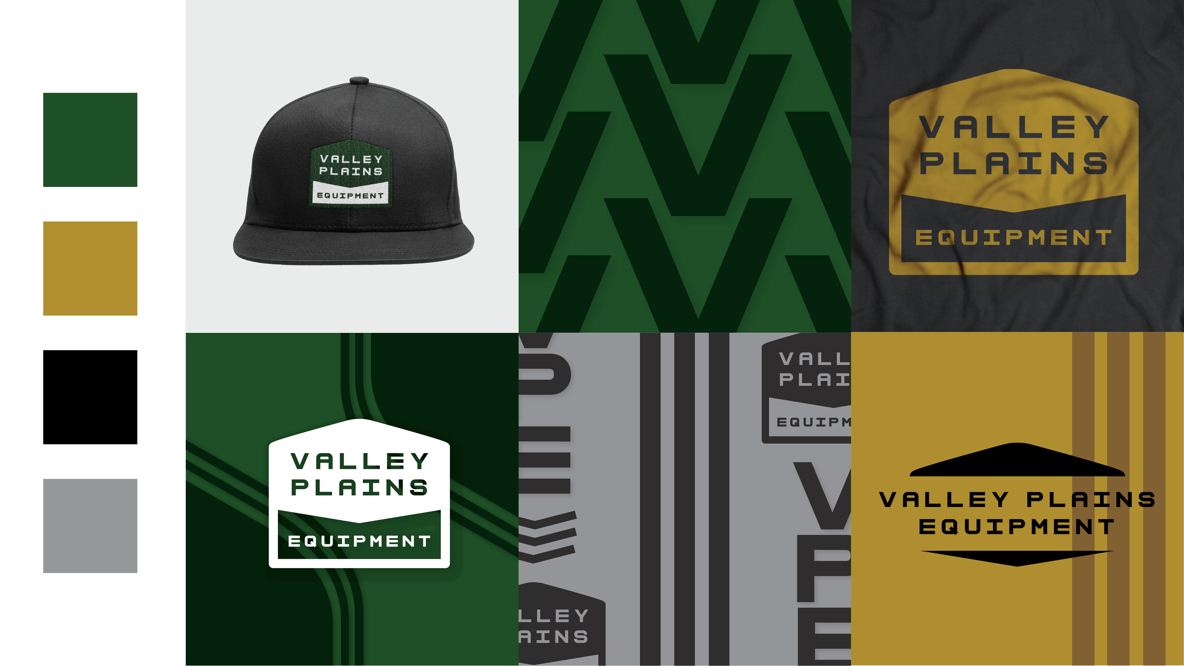
Below are original concepts I presented, they ranged from modifications on the logo to complete overhauls and gave the client a range of options and approaches to consider.
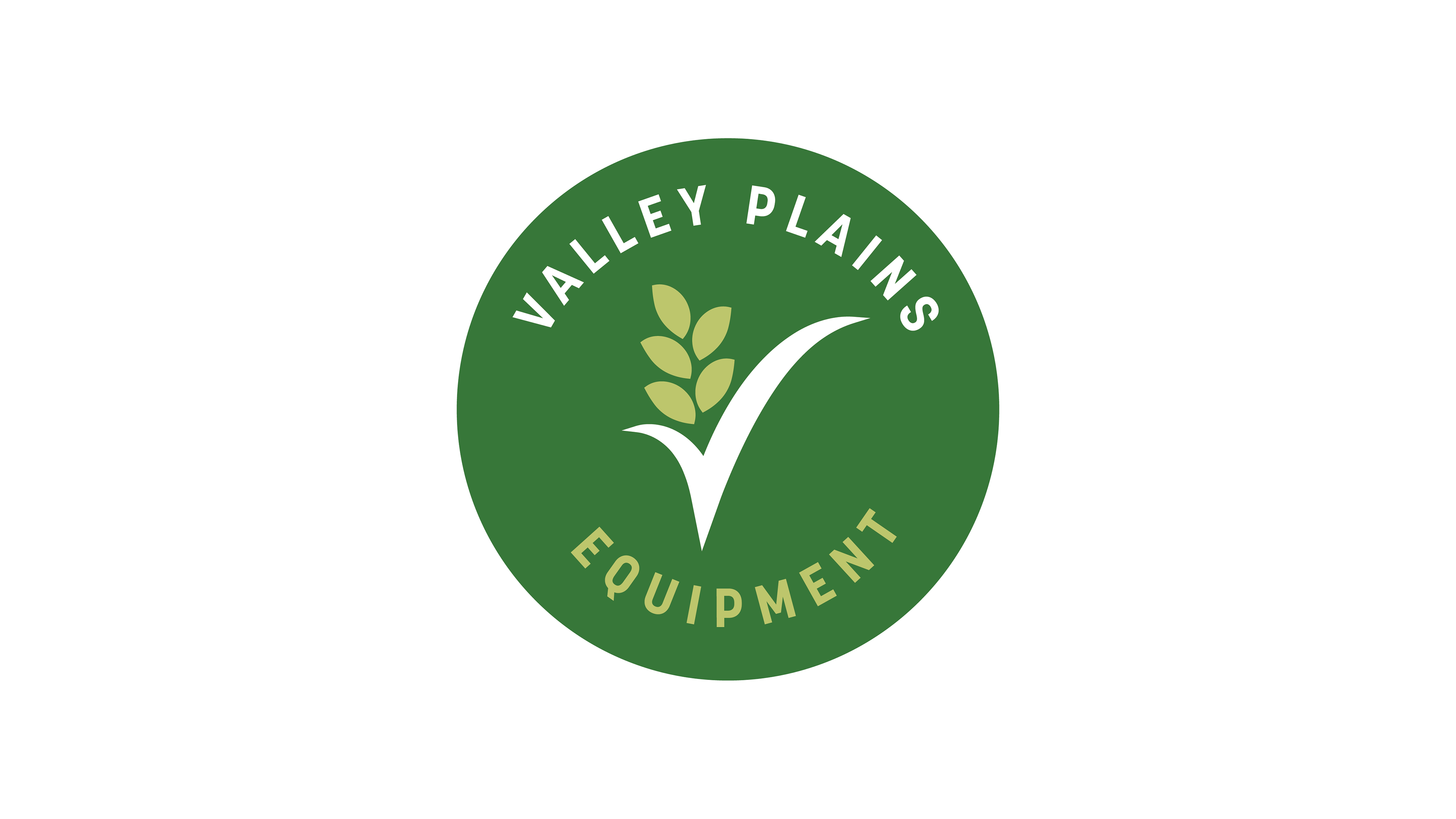
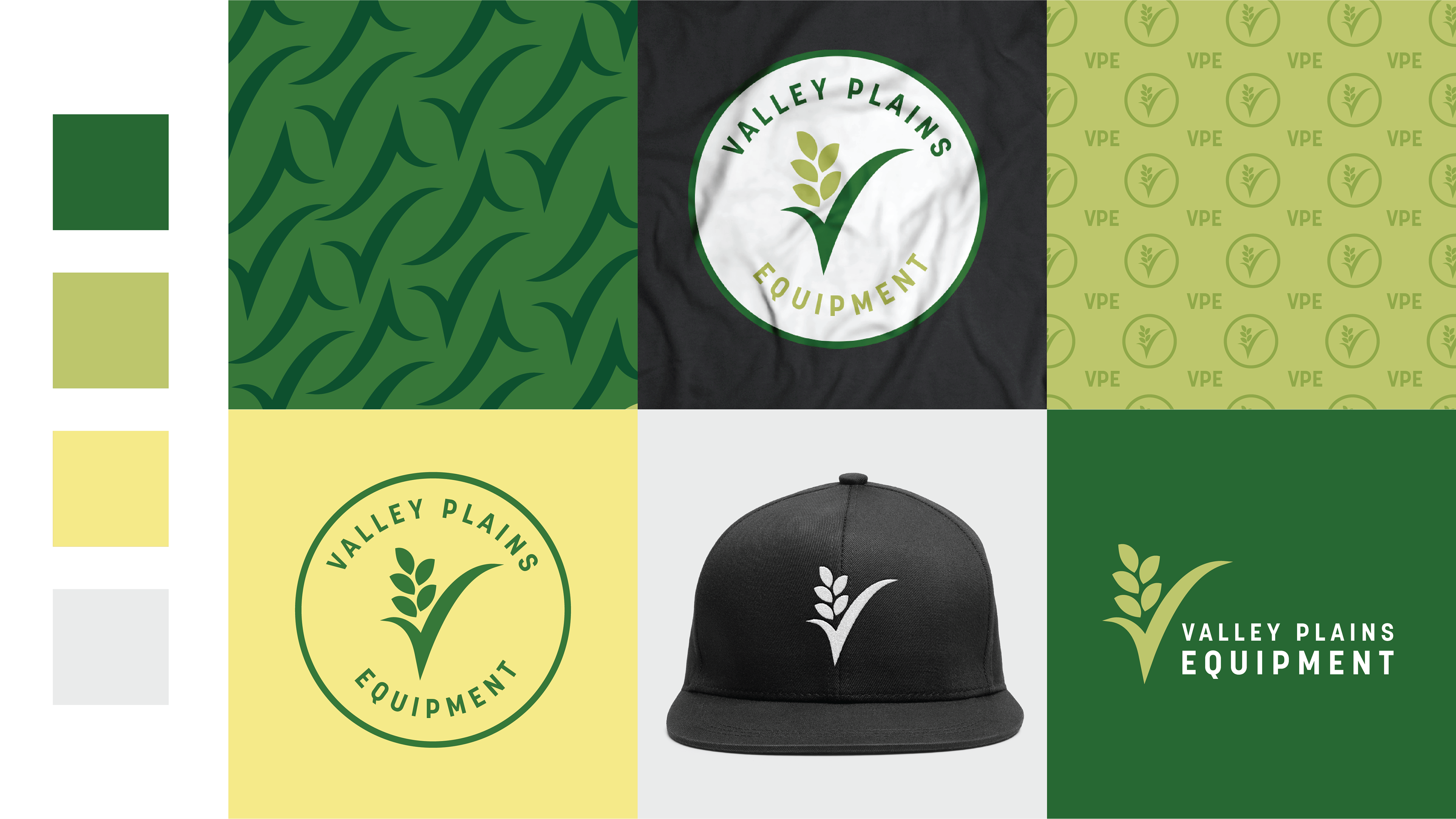
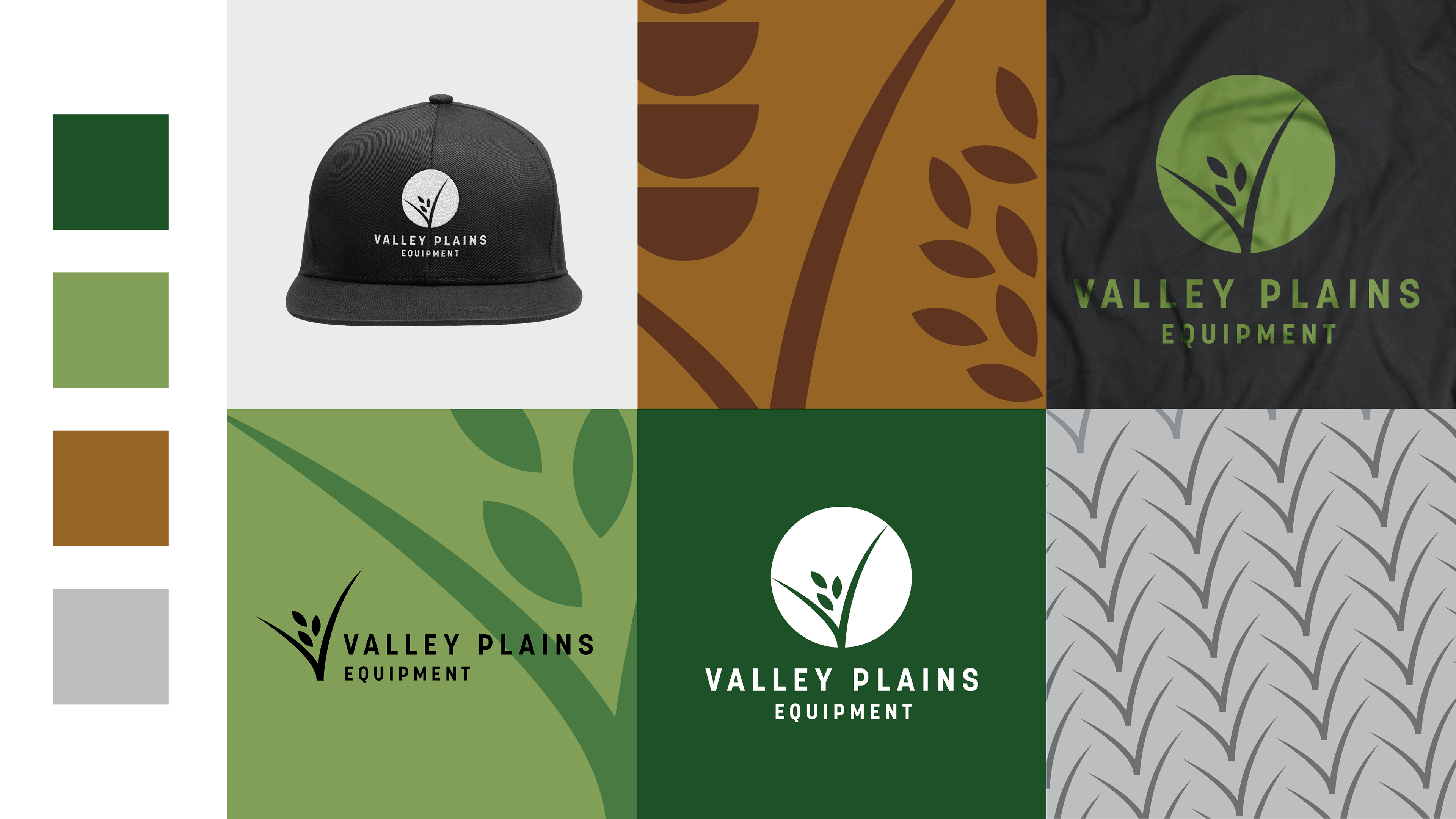
Concept 1
Concept 1 was a modernization of the current logo. I cleaned up the icon and type and transitioned to using a circle as the mark. This felt the most similar to the current brand and had a secondary logo option that highly mimicked the original logo.
Concept 2
Concept 2 was again similar to the original logo in the mark, but gave some playfulness and organic feel to the brand. This one was supposed to help emulate the relationships they have with their customers and their flexibility in what they will do for them.
Concept 3
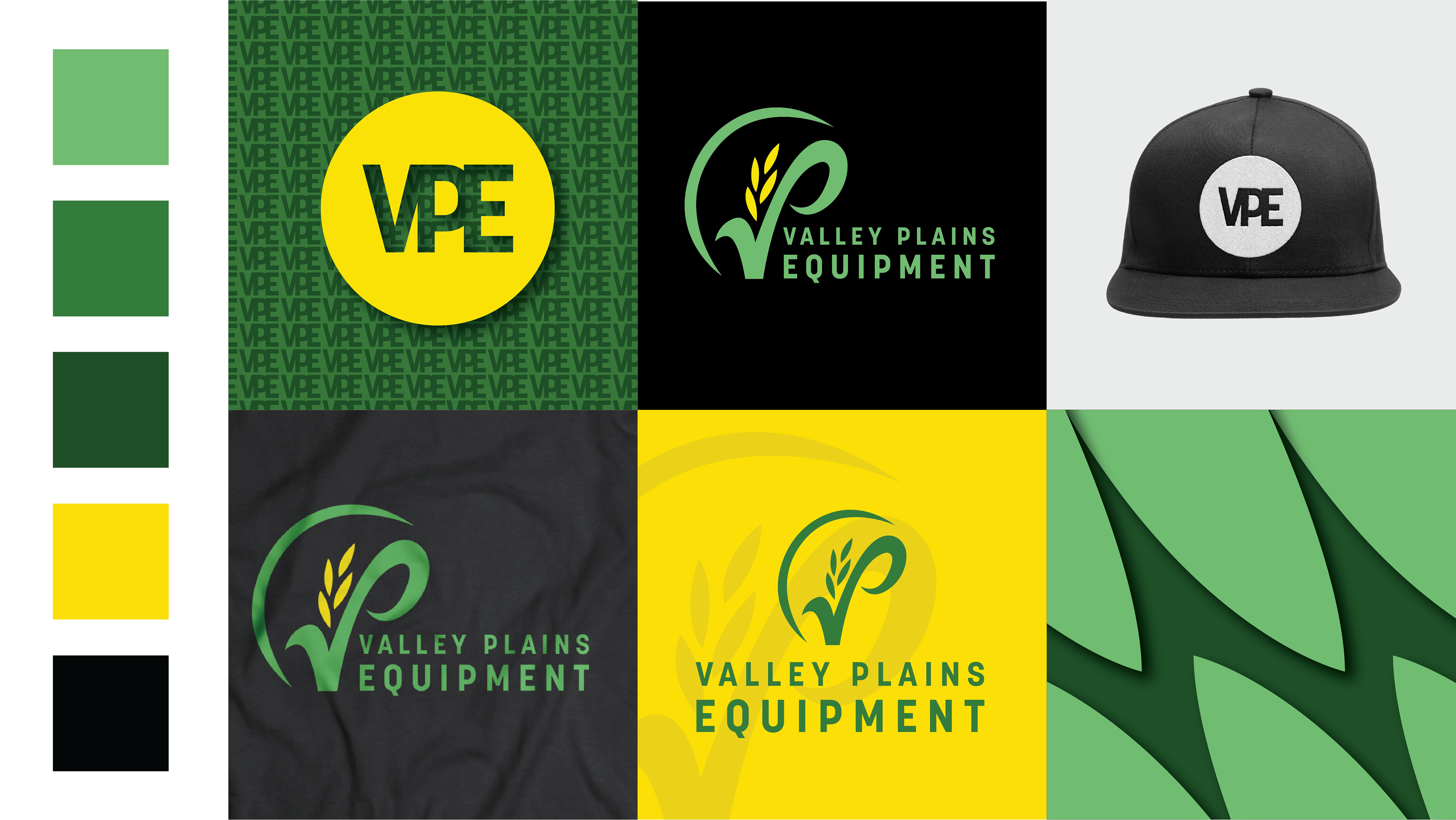
Concept 3 was a new take on the corn plant and "V" relationships. I really wanted to integrated the imagery into the type for this one and chose a font that reflects the shape of the corn leaves. This concept was all about stronger type and deeper colors calling to the seriousness of the farmer and the work they do.

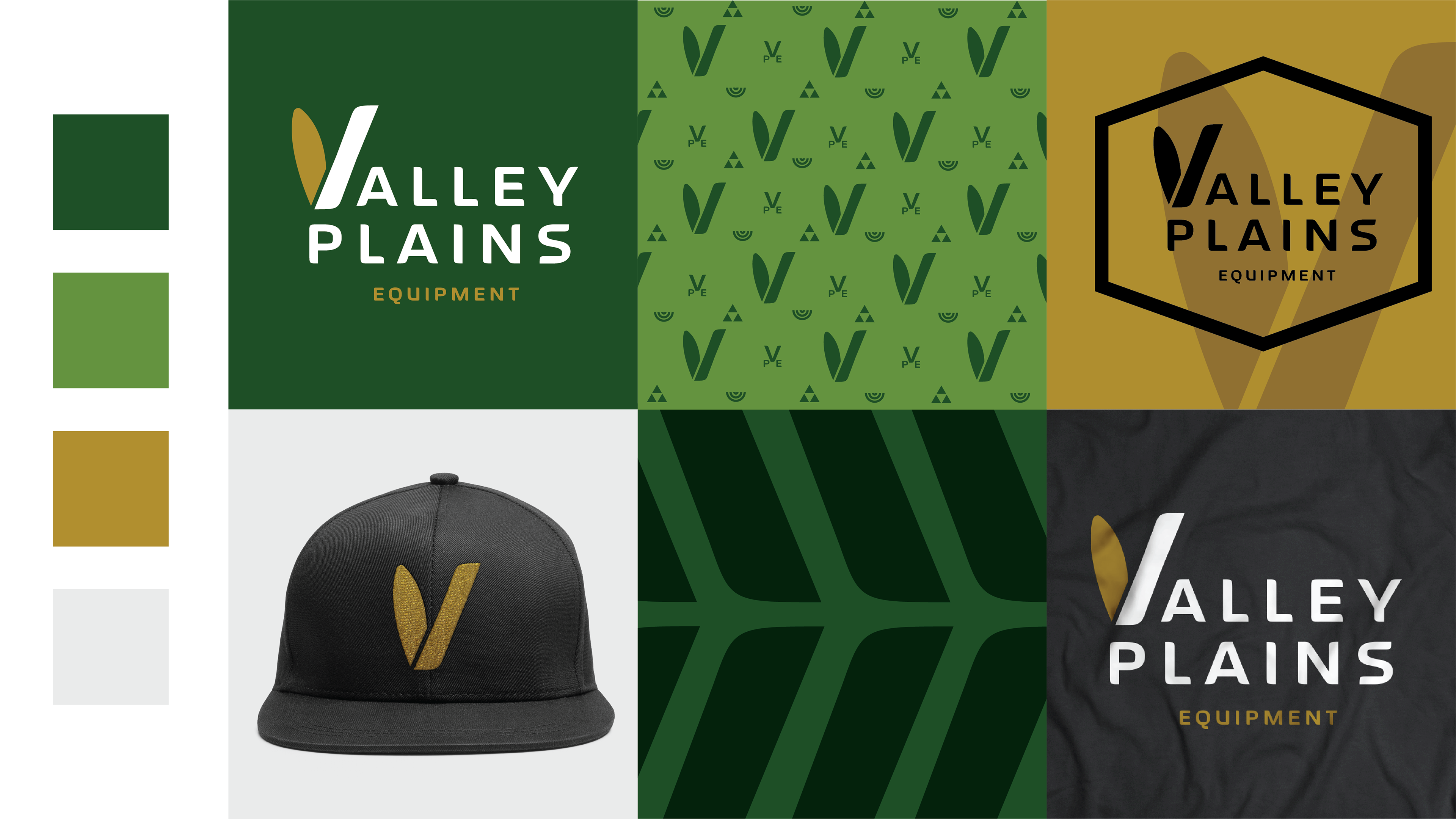
Concept 4
Concept 4 was my stretch concept, but ultimately my favorite. The logo mark mimics from the front of a truck or tractor and gave the brand a much stronger masculine feel. I played into the darker green and mustard yellows to mimic this in the color system. I knew this would be the biggest stretch for the client so I blew out additional assets to help them see how this would come to life.